Make the gold black lamp look elegant instead of heavy
Black and gold are one of the strongest color combinations in interior design. Black brings clarity, depth and graphic calm. Gold brings warmth, shine and a touch of luxury. However, it is precisely this strength that can be overturned: a lamp in gold and black can quickly appear dominant, heavy or too decorative if the proportions, light and surroundings are not right.
The good news: one Lamp Gold Black doesn't have to look opulent or bulky. If chosen correctly, it looks like a piece of jewelry in the room, not like a foreign body. What is crucial is that black and gold do not simply stand next to each other, but rather take on a clear design task.
Why gold and black quickly seem heavy
Black has visual weight. It absorbs light, strongly outlines contours and attracts the eye. Gold does the opposite: it reflects, shines warmly and has a high-quality appearance. Together they create a strong contrast that can quickly become too loud in small rooms, low ceilings or minimalist interiors.
It becomes particularly problematic when several factors occur at the same time: a closed black shade, a low-hanging pendant lamp, shiny gold, dark furniture and cold white light. Then the lamp does not appear elegant, but rather heavy and staged.
Elegance, on the other hand, comes from balance. The lamp can be noticeable, but it should not dominate the room. She should set a clear line, but have enough air around her. And it should glow warmly without dazzling gold.
Dose black, use gold selectively
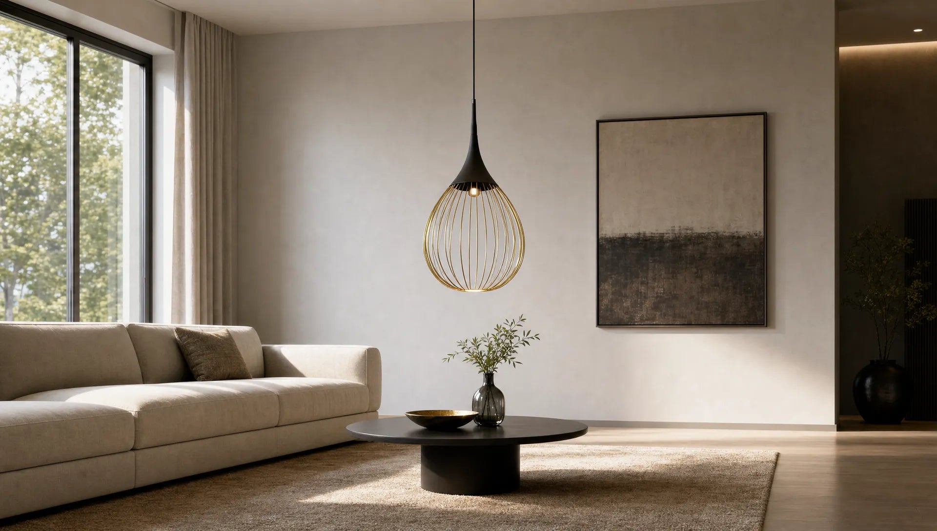
With gold-black lamps, it's not just the color that matters, but also its distribution. A light effect often occurs when black forms the structure and gold is only used as an accent, for example on frames, insides or small connecting elements. This way the light remains graphic, but gets warmth.
Conversely, gold can also take on the main role if black only appears as a fine outline. This is particularly suitable for bright rooms where a golden body does not look too lavish. It is important that the dark areas do not become too closed and large.
| Component of the lamp | This makes it seem easier | Be careful |
|---|---|---|
| frame | Filigree black lines, open arms, slim rings | Solid black bodies or wide bars |
| Screen | Opal glass, clear glass, bright interior | Completely closed black umbrellas |
| Gold accent | Brushed gold, champagne gold, small details | Reflective yellow gold on large surfaces |
| Cable and canopy | Slim, colour-coordinated, cleanly positioned | Cables too long, large dark ceiling tiles |
A simple rule of thumb: the smaller or lower the room, the finer the black should be used. In spacious rooms with high ceilings, the lamp can be much more present without appearing heavy.
The shape determines the visual lightness
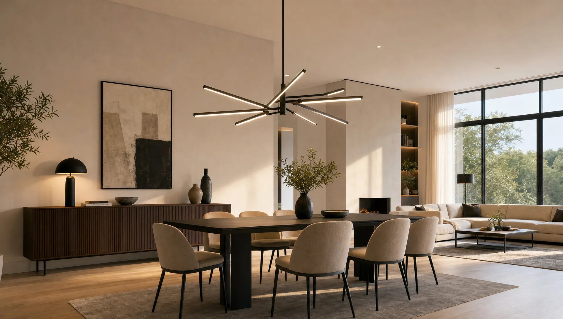
A lamp in gold and black looks particularly elegant when it is open. Filigree rods, fine rings, glass cylinders or asymmetrical arms leave lines of sight clear. The eye can see through the lamp, which means it takes up less space despite the dark color.
Closed shapes appear stronger. A black drum shade, a solid metal body or a wide ceiling plate can be beautiful, but they require room height and a deliberately reduced environment. In a small dining room or above a compact kitchen island is a linear, open Pendant Lamp usually more harmonious.
The direction of the shape also plays a role. Vertical, slim elements visually stretch the room. Horizontal lights above dining tables or islands look elegant if they are not hung too low or too wide. Round shapes appear softer, angular shapes appear more architectural.
If you would like to learn more about the effect of dark lights, see the article about one black Pendant Lamp without visual heaviness additional design principles.
Surfaces: Matte black needs warm gold
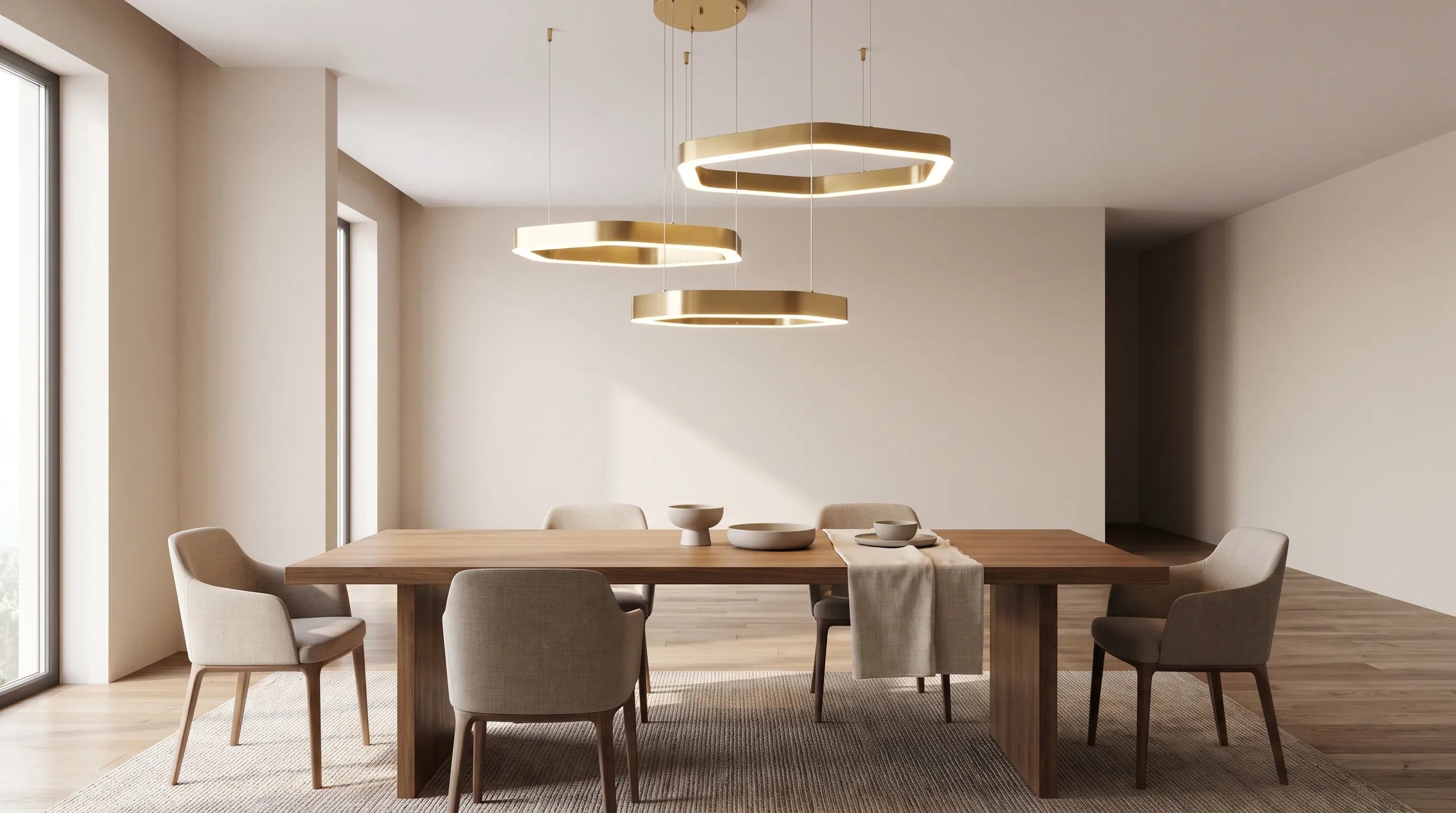
The most elegant effect is usually created by contrast in the surface. Matt black looks calm and modern. Brushed or satin gold looks warm but not bright. This combination is often safer for modern living spaces than high-gloss black with highly reflective gold.
Shiny surfaces are not wrong, they just need to be used more consciously. In an Art Deco-inspired room, with velvet, marble and dark woods, shiny gold can look great. In a Scandinavian or Japanese-style interior, however, it quickly seems too loud.
Materials in the area help ground the lamp. Light wood takes the weight off gold. Travertine, limestone and ceramics provide peace and quiet. Linen, bouclé and matt wall colors soften the contrast. For more ideas on color matching, the guide on how to choose one is also worth reading Combine lamp black and gold stylishly lets.
Light color: Elegance doesn't just come from design
A beautiful lamp only appears light if the light is pleasant. Light that is too cold often makes gold appear artificial and increases the contrast to black. On the other hand, light that is too warm can turn very yellow, especially if the lamp is gold on the inside.
Warm white light is usually the best choice for living spaces. In the dining room and living room, around 2700 Kelvin appears cozy and high-quality. In kitchens or work areas, 3000 Kelvin can be useful because it appears a little clearer and fresher. Good color reproduction is also important, especially above dining tables, with works of art or in open-plan kitchens.
| space or situation | Suitable light color | Effect |
|---|---|---|
| Living room | About 2700 Kelvin | Warm, soft and homely |
| Dining area | 2700 to 3000 Kelvin | Inviting but clear enough for table settings |
| Kitchen | About 3000 Kelvin | Fresher and more functional |
| bedroom | Around 2700 Kelvin, can be dimmed | Quiet and relaxing |
| hallway | 2700 to 3000 Kelvin | Friendly without appearing cold |
Dimmable light is particularly helpful. During the day the light can be more present, but in the evening a reduced light is often sufficient, allowing the gold to reflect gently.

Room by room: This is how the lamp remains elegant
A gold and black pendant light can be the centerpiece in the dining room. It should be based on the shape of the table. Linear lights or several slim pendants work well over a long table. Above a round table, a round or cluster-like shape looks more harmonious. As a guide, the lamp should not be wider than the table and visually leave enough distance from the table edges.
In the living room, restraint is often more elegant. If the ceiling light is already black and gold, floor and table lamps should not all repeat the same strong color combination. A combination of a main light and subtle secondary lights in black, brass, glass or natural materials is better.
In the kitchen, the lamp must not only be beautiful, but also functional. Above the kitchen island, black lines look very modern, while gold details bring warmth to the often sleek space. Make sure there is glare-free light and a position that does not disturb your view or work surface.
In the hallway, ceiling height and freedom of movement are crucial. A lamp that hangs too low quickly appears cramped. Flat ceiling lights, small pendants or wall lights with gold accents can be more elegant than a large chandelier.
In the bedroom, the combination can appear softer. Black contours, gold frames and opal glass create atmosphere without being too dramatic. It is particularly beautiful when the lamp is combined with textiles in cream, taupe or warm gray.
Choose the right colors in the environment
A lamp in gold and black needs an environment that absorbs its contrast without repeating it. If every detail in the room is also black or gold, a decorated, heavy overall image quickly emerges. It is more elegant to use the color combination as a deliberate accent.
Light, warm wall colors are almost always a safe basis. Greige, warm white, sand, cream or very light taupe make black appear clear and gold shine softly. Cool grays can work, but they make the combination more severe.
| Surrounding color or material | Effect with gold-black |
|---|---|
| Warm white, cream, greige | Elegant, bright and timeless |
| Light wood | Natural, homely and less austere |
| Dark wood | Luxurious, but only recommended if there is enough light |
| Travertine, limestone, ceramics | Quiet, high quality and modern |
| Deep green or burgundy | Dramatic and classy, more suitable for larger rooms |
| Cool light gray | Modern, but can appear distant |
If black plays a larger role in the room overall, for example on window frames, furniture handles or shelves, the lamp should be more delicate. For additional tips on balancing dark accents, see the post about one black lamp in the living room.
Don't underestimate proportions, ceiling height and canopy
Many lights appear heavy not because of their color, but because of incorrect proportions. A beautiful pendant light can appear uneasy if the cable is too long, the canopy doesn't fit the ceiling, or the light hangs too close to furniture.
Above dining tables, the lower edge of a pendant light is often around 60 to 75 centimeters above the table top. This isn't a hard and fast law, but it's a good starting point. In rooms with very high ceilings, the light may hang more heavily into the room. In low rooms it should stay closer to the ceiling or be particularly light.
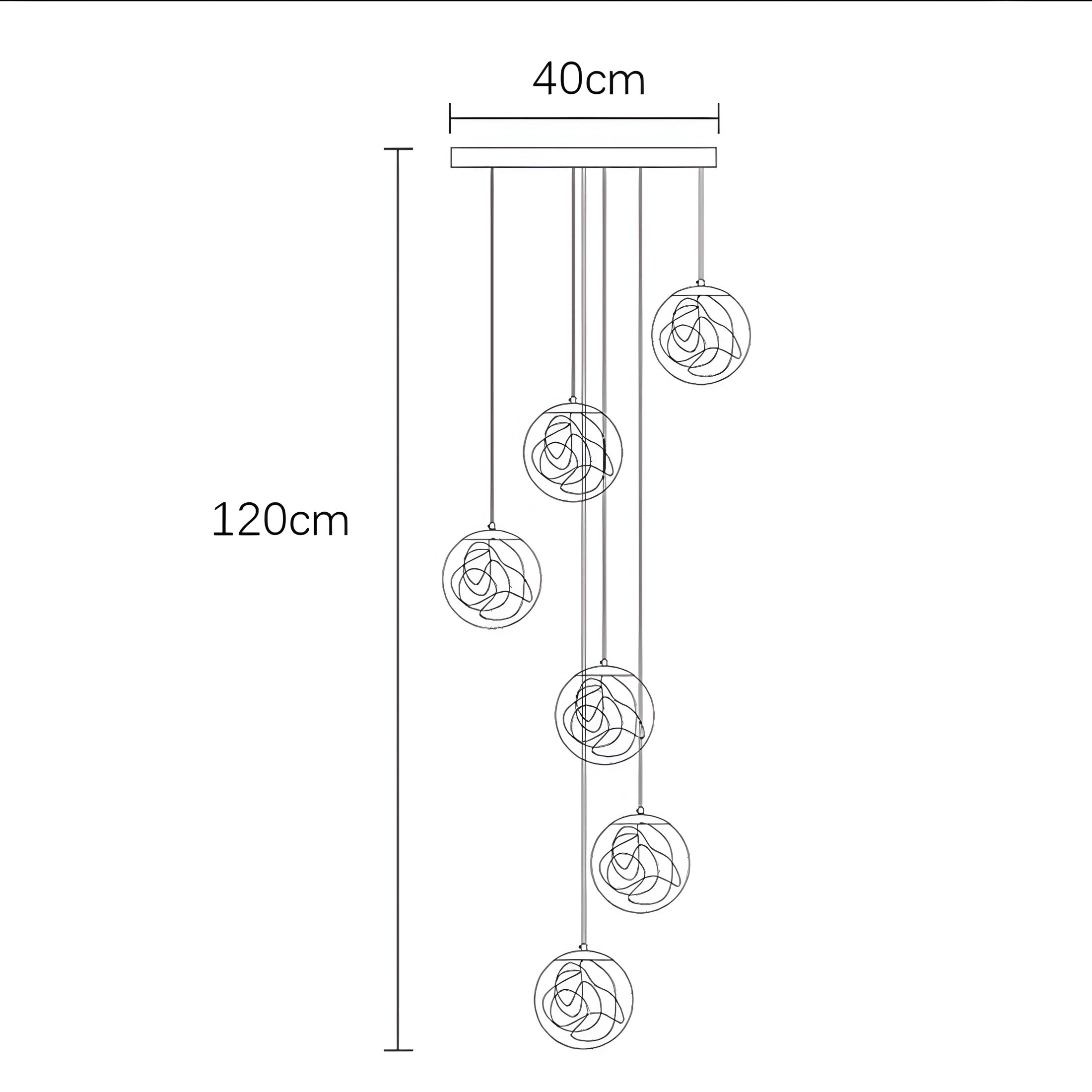
The canopy also influences the effect. A large black ceiling tile can look heavy on low ceilings. A slimmer, color-matched or individually planned canopy often appears calmer. This is exactly where an adjustment is worthwhile, especially for renovations, old buildings, open floor plans or offset power outlets.
At BUYnBLUE Chandeliers and pendant lights can be customized free of charge, for example in terms of cable length, canopy or color. This is particularly helpful when a lamp in gold and black not only needs to look beautiful, but also needs to sit architecturally clean in the room.
Typical mistakes and the more elegant alternative
Gold and black are unforgiving when too many strong decisions come together. The following overview helps to avoid the most common pitfalls.
| Common mistake | Why it seems difficult | More elegant solution |
|---|---|---|
| Big black umbrellas in small rooms | They block light and lines of sight | Choose open shapes or glass |
| Several gold and black lights in the same room | The look quickly appears staged | Set a main light and keep secondary lights quieter |
| Cool white light | Gold appears harsh and black contrasts more strongly | Use warm white or neutral-warm light |
| Too much black furniture too | The room loses lightness | Light textiles, wood and stone complement the look |
| Incorrect hanging height | The lamp acts like an obstacle | Check the proportions to the ceiling and the furniture |
Before you buy, it's worth doing a quick reality check: Which color already dominates the room? Are there enough bright areas? Should the lamp be an eye-catcher or a quiet accent? And does the size match the ceiling height, not just the table size?
FAQ
Does a lamp in gold and black also fit in small rooms? Yes, if it is delicately designed. Choose open shapes, sleek black lines and subtle gold details. Bright walls, glass and warm light also help to keep the effect light.
What color light is best for gold-black lamps? Around 2700 Kelvin is usually ideal for living rooms and dining rooms. In kitchens or work areas, 3000 Kelvin may be more suitable. It is important that the light does not get too cold so that gold appears warm and high-quality.
Can you combine a gold and black lamp with other metals? Yes, but one metal should dominate. Gold can be combined well with black, bronze, brass or even subtle chrome if the surfaces remain calm and not all metals appear equally strong.
How does a gold black lamp look more modern and less classic? A modern effect is created by clear lines, matt surfaces, open shapes and a reduced environment. Avoid too many ornate details, shiny gold and overloaded decoration.
What is more important: color or shape? The form is often more important. An open, well-proportioned lamp appears light, even in black and gold. A compact, closed shape, on the other hand, can appear heavy even with perfect color coordination.
Choose the right gold black lamp carefully
A gold-black lamp is successful if it refines the room without weighing it down. Look for delicate shapes, warm light colours, matt or brushed surfaces and a size that matches the furniture and ceiling height.
At BUYnBLUE You will find a curated selection of modern designer lights for different living areas. The free customization service for chandeliers and pendant lights is particularly practical, so that the cable length, canopy or color matches your room. With free worldwide shipping, 14-day returns and secure ordering, you can plan the right lamp in a relaxed manner.