Combine vintage lamps in a modern way instead of overloading them
Vintage lamps bring something into rooms that new furniture alone rarely achieves: patina, history and a certain naturalness. But that is exactly where the challenge lies. If too much nostalgia is used at once, a room quickly looks like a hodgepodge instead of a deliberately designed home.
Modern combined doesn't mean hiding vintage. It means using individual lights in such a way that they can show character without visually weighing down the room. The key lies in proportion, material reference, quality of light and a clear decision: which lamp should really stand out and which lighting should calmly support the room?
Why vintage lamps quickly make rooms appear overloaded
Vintage lamps are often more strongly designed than very reduced modern lamps. They have visible details, special shades, brass surfaces, opal glass, curved arms, fringes, ceramic feet or eye-catching joints. These features make them attractive but also create visual weight.
A room usually appears overloaded not because of a single vintage lamp, but because of too many competing signals. When a brass pendant light, a patterned rug, dark wood furniture, framed art, velvet, ceramics, and multiple decor objects beg for attention at once, the eye lacks a resting point.
A modern look is therefore not created by removing all old elements, but rather through conscious reduction. A vintage lamp can be the emotional centerpiece. Everything else should either give it space or create a clear connection to it.
One main role per line of sight
A simple rule for interior designers and renovators is: only one strong vintage element should dominate per line of sight. A line of sight is what you directly perceive when entering a room or sitting on the sofa.
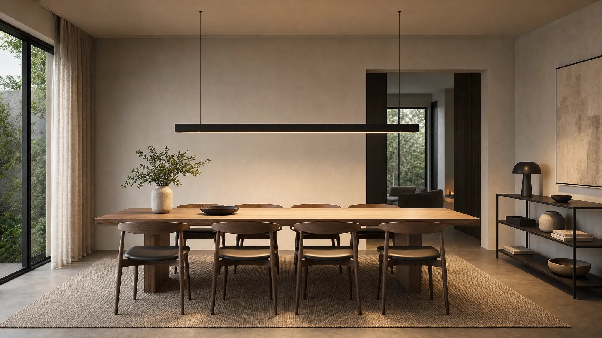
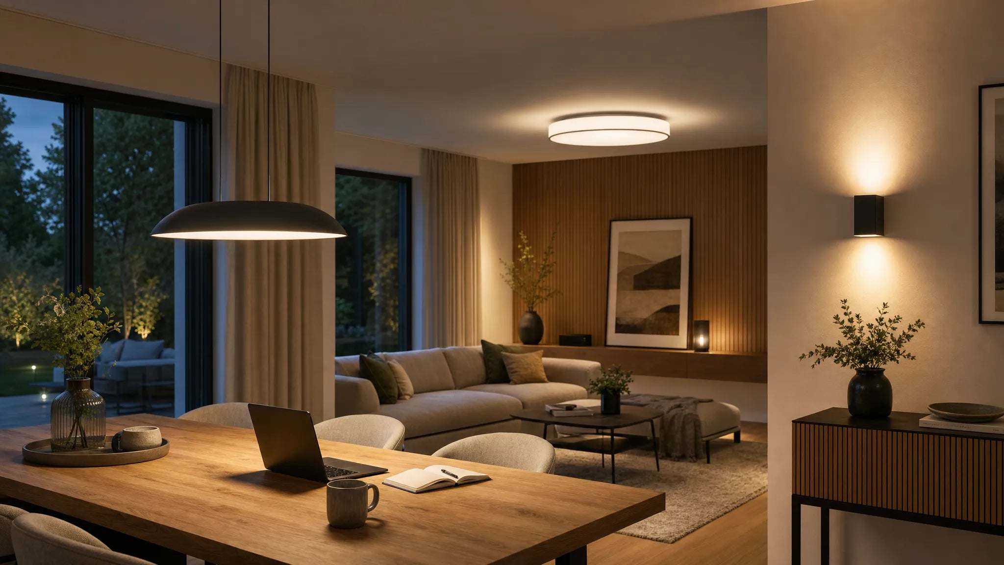
In the living room, this can be a striking floor lamp next to the sofa. In the dining room, a vintage-inspired pendant light above the table. In the bedroom, perhaps a bedside lamp with a ceramic base or a small wall arm with a brass finish. If several of these lights are in the same field of vision, they should have different presences: a main light, a reserved accompaniment.
| situation | Which quickly seems overloaded | Modern alternative |
|---|---|---|
| Dining room | Large vintage chandelier plus heavy sconces plus dark furniture | A characterful pendant lamp, combined with quiet wall lights or indirect light |
| Living room | Several eye-catching lampshades in different colors | A vintage floor lamp as an accent, complemented by simple table or ceiling lights |
| bedroom | Two dominant bedside lamps and an additional opulent ceiling lamp | Small vintage accents on the bed, quiet basic lighting on the ceiling |
| hallway | Lots of small decorative lights in a small space | A striking lamp, clear wall colors and few accessories |
This limitation ensures that vintage lamps do not appear random, but rather curated. This clarity is crucial, especially in modern interiors.
Connect materials instead of adding styles
The most common mistake when combining vintage and modern is simply juxtaposing different styles. A lamp is retro, the table is Scandinavian, the carpet is oriental, the chairs are industrial and the wall color is minimalist. This can work if there is a connecting element. Without connection it seems restless.
Materials are particularly suitable for this. If a finish is repeated in two or three places in the room, more harmony is immediately created. A vintage brass lamp can be found, for example, in a picture frame, a furniture handle or a small side table. A lamp with black metal looks more modern when it matches black chair legs, window frames or a simple console.
It is important not to repeat each material several times. Two to three conscious repetitions are enough. If you would like to find out more about the basic principles of harmonious lighting combinations, you can find out more in the guide modern lamps that work harmoniously together in the room additional orientation.
The 70/20/10 rule for modern vintage rooms
A helpful design formula is the 70/20/10 rule. It's not a hard and fast rule, but it does prevent a room from becoming too thematic. Especially with vintage lamps, it helps to see the difference between “characterful” and “overloaded” more clearly.
| share | meaning in space | Example with vintage lamps |
|---|---|---|
| 70 % | Quiet base | Neutral walls, clean furniture, understated carpets, simple curtains |
| 20 % | Character and contrast | A vintage pendant lamp, an antique mirror, a special armchair |
| 10 % | Small accents | Candle holders, pillows, vases or art with similar color or materiality |
If the vintage proportion becomes significantly larger, the room can quickly appear heavy. This is especially true with dark woods, warm metals and patterned textiles. Modern surfaces such as smooth walls, clear lines, light fabrics and reduced furniture give such pieces the stage they need.
Light quality is more important than nostalgia
A vintage lamp can be perfect in terms of design and still not work if the light is unpleasant. Light that is too cold makes warm materials appear dull. Lights that are too weak make the room impractical. Points of light that are too strong dazzle and destroy the atmosphere.
Warm white light is usually the safest choice for living spaces. Many people find around 2,700 Kelvin comfortable, while 3,000 Kelvin can seem a little clearer and more modern. It is crucial that the light color in the room does not change wildly. If pendant lamps, floor lamps and wall lamps have different light colors, even a beautifully furnished room appears restless.
Dimmability is also a big advantage. A vintage pendant light over the dining table can be brighter when working and dimmed when dining. In the living room, one lamp should not have to illuminate the entire room alone. A mixture of basic light, zone light and accent light is better.
Room by room: This keeps the look modern
Vintage lamps work particularly well in the living room when they mark a cozy zone. A floor lamp next to an armchair, a small table lamp on a sideboard or a pendant lamp above the coffee table can add depth to the room. To keep the look modern, large areas should be calm: a simple sofa, few cushions, clear wall design.
The lamp can be more prominent in the dining room because the table is a natural focal point anyway. A vintage-inspired pendant light above a modern wooden table can look very elegant. Make sure it is at the right height: the lamp should illuminate the table but not disturb the view between people. For high ceilings or special floor plans, an adjusted cable length can be crucial.
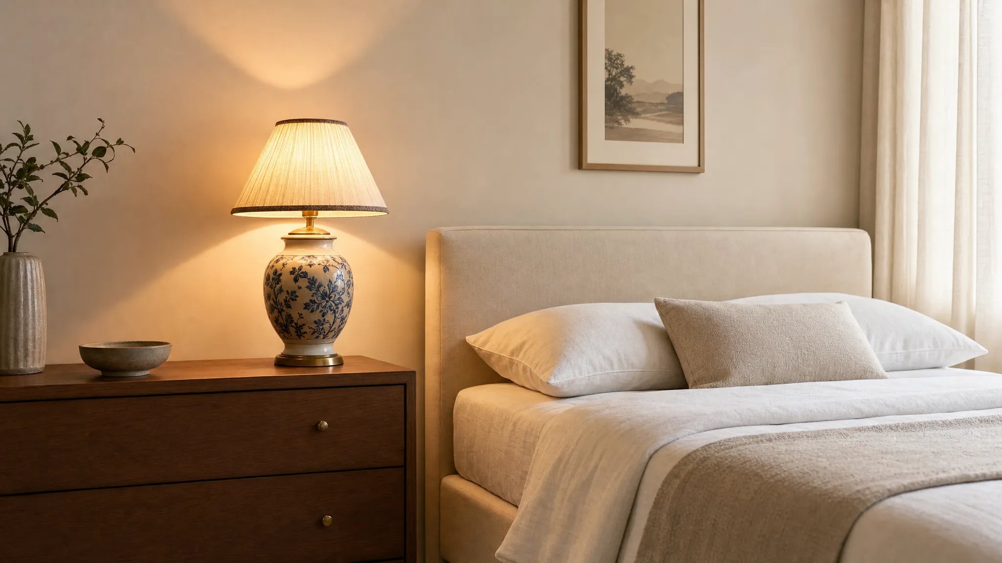
Restraint is particularly important in the bedroom. Here light is supposed to calm you down. Vintage lamps with fabric shades, frosted glass or warm metal appear softer than exposed bulbs. If you use two bedside lamps, you should create a clear repetition in terms of shape or color. Different vintage individual pieces can be charming, but they need a common basis, for example identical light colors or similar shade shapes.
In the kitchen and hallway, vintage lamps are most dependent on size and function. Light must be practical in the kitchen, but it must not be restrictive in the hallway. Here, individual accents work better than decorative abundance. A small pendant light, a clear glass globe or a subtle wall light can create enough vintage character without overloading the room.

Typical mistakes when combining vintage lamps
Many rooms don't look inconsistent because the lamp you choose is wrong. Often it is due to the environment. A beautiful lamp needs context, distance and a clear function.
These errors occur particularly frequently:
- Too many eye-catching lights in one room compete with each other.
- Different metal tones are mixed without any visible concept.
- Vintage lamps are combined with many other nostalgic objects.
- The light color does not match the materials in the room.
- The lamp is too large or too small in relation to the table, sofa or room height.
- Decorations are piled directly around the lamp instead of giving it air.
A good test is to look out the door. If you enter the room and three to four things immediately catch your eye at the same time, the design needs more calm. First, remove decor, not the lamp. It is often enough to simplify surfaces, reduce colors or repeat a material in a more targeted manner.
Vintage table lamps as a controlled introduction
If you want to try out the style carefully, it's best to start with a table lamp. It is flexible, easy to move and changes a room less permanently than a large ceiling light. On a sideboard, bedside table or small side table, it can add just the right amount of nostalgia.
To ensure that a vintage table lamp does not appear old-fashioned, it needs a modern environment. A pared-down sideboard, a large-format picture, a calm wall color or a clear mirror can instantly update the look. It becomes particularly harmonious when the lamp is not placed together with many small decorative objects. A stack of books, a vase or a bowl is usually enough.
For this special type of lamp, it is worth taking a closer look at the question of how to get one Vintage table lamp combined correctlywithout making the room look old-fashioned.
Contrast is better than perfect purity of style
A room appears modern when contrasts are consciously used. Vintage lamps don't necessarily need antique furniture. On the contrary: an opulent lamp can have a particularly strong effect over a very simple table. An old glass or brass shade gains freshness when placed in front of a smooth wall, next to clean lines or above a minimalist piece of furniture.
The trick is not to make the contrast look random. If the lamp is very decorative, the furniture underneath should be quieter. If the lamp is simply vintage, perhaps with a simple spherical shape or delicate metal arm, the room can have more texture. It should always be clear which element takes the lead.
Colors also play a big role. Warm vintage tones such as brass, amber, cream, smoked glass or dark wood appear lighter when combined with off-white, greige, stone, sage green or deep blue. Pure white and black can look very modern, but create stronger contrasts. This is ideal for clear, architectural spaces, less so for very small or already detailed rooms.
Custom-made design prevents visual clutter
One of the underestimated causes of overloading is not style, but incorrect fit. A pendant light that hangs too high loses its effect. A suspension that is too long can be disruptive in low rooms. A canopy that doesn't match the ceiling position makes even a high-quality light appear improvised.
Especially with vintage-inspired chandeliers and pendant lights, customization is more than just a technical detail. It decides whether the lamp seems like a foreign body or whether it naturally belongs to the room. At BUYnBLUE Chandeliers and pendant lights can be adjusted free of charge, for example in terms of cable length, canopy or color. This is particularly helpful with high ceilings, offset power outlets, or open living areas.
If you are looking for a high-quality lamp that not only looks good but can also be coordinated with the room, you will find it at BUYnBLUE modern designer lighting for different living areas with free worldwide shipping and a 14-day return policy.
How to check whether your combination is successful
Before you buy additional lights or decorations, it's worth doing a quick styling check. View the room in daylight and in the evening with the lamps on. Vintage lamps change their effect greatly depending on the lighting mood.
First, ask yourself whether the light serves a clear purpose. Does it illuminate a table, create atmosphere, mark a reading corner or serve as an accent? If the answer is unclear, it seems more decoratively tacked on than integrated.
Then check the repetition. Is the material, color or shape of the lamp reflected somewhere discreetly? This can be a brass detail, a round vase, a wood tone or a warm fabric. It shouldn't seem obviously copied, but rather like a quiet connection.
Finally, a photo helps. Rooms often appear more honest in photos because the eye is less influenced by memories and favorite pieces. If the lamp appears strong in the photo but does not dominate everything, the balance is usually well struck.
Frequently Asked Questions
How many vintage lamps can a room tolerate? In many living rooms, one dominant vintage lamp per line of sight is sufficient. Additional lights may be added, but they should be simpler or clearly reflect the material, color and light temperature.
Can you combine vintage lamps with very modern furniture? Yes, it is precisely this contrast that often appears particularly high-quality. It is important that the modern base remains calm and the vintage lamp is deliberately used as an accent.
Which light color suits vintage lamps? Warm white light is usually ideal. Around 2,700 Kelvin seems comfortable, 3,000 Kelvin seems a little clearer and more modern. What is crucial is a uniform light color throughout the entire room.
Do brass lamps automatically look old-fashioned? No. Brass looks modern when combined with clear shapes, reduced furniture and calm colors. However, too many gold or heavily decorated details can quickly make the look heavy.
What to do if a pendant light doesn't fit the height of the room? Then it makes sense to adjust the cable length. In high, low or unusually shaped rooms, a dimensionally adapted luminaire can have a much more harmonious effect.
Conclusion: Vintage needs space, not mass
Combining vintage lamps in a modern way means consciously giving them space. Instead of collecting a lot of nostalgic elements, it is better to set a few strong accents, repeat materials in a targeted manner and pay attention to pleasant lighting quality. This creates a space that feels warm and personal without being heavy or overloaded.
If you're looking for a pendant light or chandelier that fits your space and not just a style image, it's worth taking a look at the curated selection of BUYnBLUE. With free customization, high-quality workmanship and free worldwide shipping, modern lighting can be planned so that it appears natural even in sophisticated room concepts.