Detecting LED light quality: That’s what matters
When it comes to LED lighting, a lot of things sound measurable: watts, lumens, Kelvin, efficiency class. Nevertheless, many people are familiar with the problem: an LED looks pleasant in the shop, but at home it looks cool, flat, restless or blinding. The reason is simple: LED light quality does not arise from a single value. It results from color rendering, light color, driver, light distribution, glare limitation and the question of whether the luminaire really fits the room.
It's worth taking a closer look, especially in modern living spaces, renovations and interior design projects. Good light makes materials appear higher quality, improves the atmosphere and supports everyday activities without causing tired eyes or harsh shadows.
What does LED light quality mean?
A high-quality LED light fulfills three tasks at the same time: it makes the room sufficiently bright, it shows colors as naturally as possible and it remains pleasant for the eyes. A lamp can be very efficient and still provide poor light quality, for example when skin tones appear gray, wood loses its warmth or the lamp visibly flickers.
It is also important to differentiate between light source and lamp. The LED module or bulb generates the light. The luminaire also decides how this light is directed, diffused, shielded or dimmed. That's why two lamps with similar technical data can appear completely different in the room.
The EU energy label primarily helps to assess the efficiency of light sources, but does not replace quality testing. The European Commission describes which information is relevant to efficiency. However, for living comfort and design, you need to consider other values.
The most important parameters at a glance
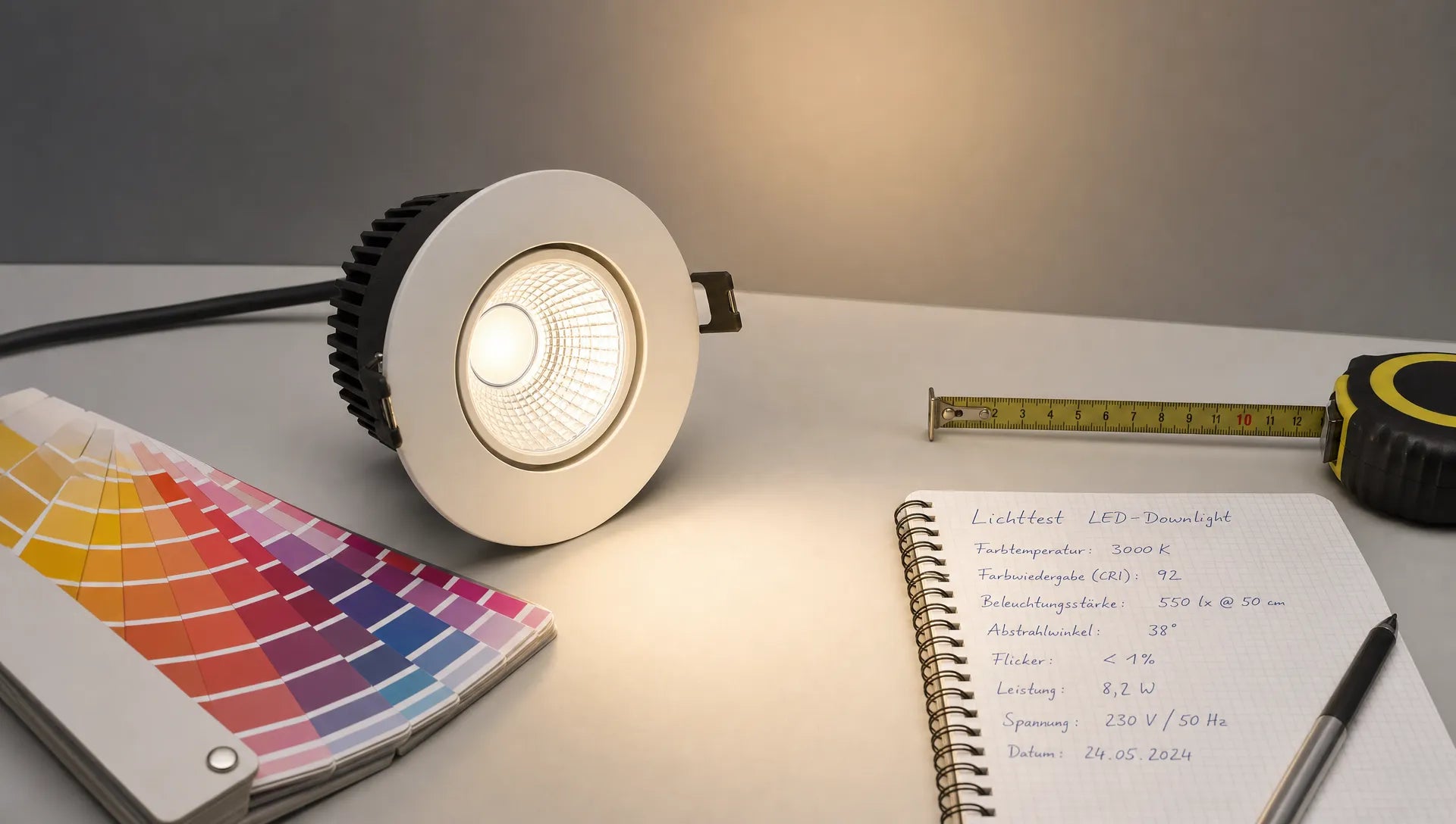
Not every data sheet is complete, but the more transparent the information is, the easier it is to assess an LED light. The following table shows which values really help.
| criterion | What it describes | Good orientation |
|---|---|---|
| Lumens | Amount of light, i.e. brightness | Choose based on room size and usage, not wattage |
| Kelvin | Light color from warm to cool | 2700 to 3000 K for living areas, 3500 to 4000 K for work areas |
| CRI/Ra | General color rendering | Ra 80 is standard, Ra 90 or higher is better for living areas with design demands |
| R9 or TM-30 | Reproduction of saturated colors, especially red | The higher and more transparent it is, the better for skin tones, art and textiles |
| SDCM | Color consistency between individual LEDs | SDCM 3 or lower appears very consistent |
| Flickering behavior | Stability of light | Flicker-free or low readings are particularly important for work and video |
| Beam angle | Width and direction of the light cone | Wide for basic light, narrower for accent light |
| Dimmability | Behavior at reduced brightness | Only really pleasant with a compatible dimmer and a good driver |
These values are not an academic matter. They determine whether a dining table looks inviting, whether a bathroom mirror is flattering, whether a home office supports focused work and whether a living room appears quiet or bright in the evening.
Color rendering: Why CRI alone doesn't say everything
The CRI value, often given as Ra, evaluates how natural colors appear under a light source. For simple spaces, Ra 80 can be sufficient. In living areas, kitchens, dressing rooms, bathrooms, galleries and high-quality interiors, Ra 90 or more is usually the better choice.
Nevertheless, CRI is not perfect. The classic Ra value takes certain test colors into account, but saturated red tones are not always adequately represented. This is exactly where visible differences arise in everyday life: skin can appear pale, red fruit loses depth, terracotta and wood appear cooler than planned. If manufacturers also specify R9 or TM-30, this is a good sign of transparency.
A simple practical test helps: look not only at white walls under the LED, but also skin, wood, fabrics, plants and colored objects. If everything looks flat or slightly greenish, the color reproduction may not be correct, even if the lamp is bright enough.
Anyone who evaluates designer lights more professionally should not only check the quality of light but also check the drivers and workmanship. This is a good addition BUYnBLUE-Guide how you Quickly check CRI, drivers and processing for designer LED lamps.
Light color: Kelvin must match the mood
Kelvin describes whether light appears warm, neutral or cool. The lower the Kelvin value, the warmer and yellower the light appears. The higher the value, the more neutral or bluish it becomes.
2700 to 3000 K are usually pleasant for living and sleeping areas because they create a relaxed atmosphere. Kitchens, hallways and bathrooms often benefit from 3000 to 3500 K, especially if materials need to be clearly visible. 4000 K can be useful for desks or technical work areas because neutral light supports concentration and makes contrasts appear clearer.
It becomes problematic when the color of the light and the function of the room do not match. A very cool LED above the dining table can make food appear unattractive. On the other hand, a too warm, weak LED in the work area can make you tired. Good LED light quality does not mean always choosing the same Kelvin value, but rather the right light color for the respective situation.
Flicker, drivers and dimming: Invisible quality
Many differences in LEDs are not in the visible design, but in the electronics. The LED driver converts electricity so that the LEDs operate stably. If the driver is poorly tuned, the light can flicker, jump when dimming, buzz or become restless at low brightness levels.
Flickering is not always consciously visible. Some people notice it as eye strain, headache or restlessness, especially during prolonged use at a desk. Smartphone cameras can also provide clues: If strong, moving streaks appear while filming, you should take a closer look. This test does not replace a measurement, but is a useful warning.
When it comes to dimming, it's not just whether a light can be dimmed that counts, but how it dims. High-quality solutions reduce brightness evenly, without color shift, flickering or abrupt shutdown. Therefore, always pay attention to whether lamps, integrated LEDs and dimmers are compatible. The quality of the electronics is crucial, especially with permanently installed LED lights, because they are not easily replaced.
Light image and glare: The room plays a decisive role
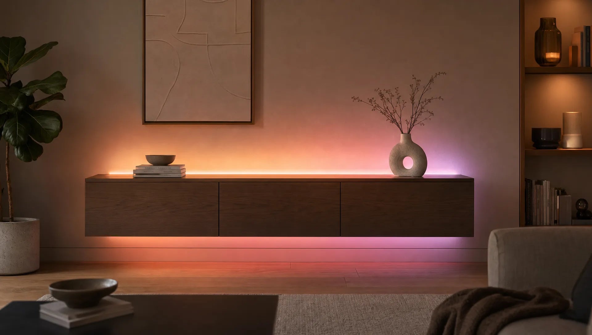
An LED with good characteristics can still be unpleasant in the room if the light pattern doesn't match. Light quality only arises when brightness, direction and shielding interact sensibly. Direct light creates a clear view, indirect light creates softness, accent light emphasizes materials and architecture.
Glare is one of the most common reasons why LED light is perceived as cold or harsh. Small, very bright spots of light can be unpleasant, even if the overall amount of light is right. Diffusers, low-lying light sources, reflectors or opal glasses help to soften the light. For desks, it is also important that the lamp does not reflect into the screen and does not cast harsh shadows on the work surface.

For a representative living area, a decorative ceiling light can, in addition to its appearance, also have a strong impact on the effect of the room. The Interstellar ceiling lamp For example, sets elegant accents in the living room and is available in different variations with different numbers of elements, which can be helpful when matching the size of the room and the desired effect.
Detect LED light quality for each room
The best LED does not exist across the board. A very good bathroom light can appear too objective in the living room. An atmospheric pendant light may not provide enough directional light above the desk. That's why you should always check light quality in conjunction with usage.
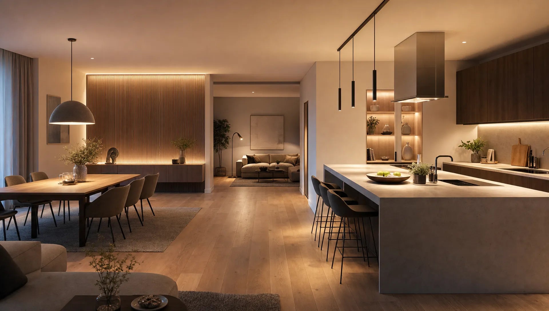
In the living room, what counts is a balanced interplay of basic light, accent light and warm light zones. Pay attention to a pleasant light color, good color rendering and a shape that does not dazzle. In the kitchen, sufficient lumens, more neutral light colors and work surfaces with few shadows are more important. What counts above the dining table is not maximum brightness, but rather a warm, low-glare light that shows food and faces naturally.
LED quality is particularly noticeable in the home office. The light color, lack of flicker, orientation and brightness levels should all match. For the office area it can Baseus LED desk lamp Make sense if you are looking for a compact light with three different light levels that does not have to be permanently connected to an external power source.
For hallways and stairwells, uniform lighting and safe orientation are more important than high design impact. In the bedroom, the light should be soft, warm and easily dimmable. Lights that enable multiple lighting moods are particularly pleasant, such as brighter light for tidying up and muted light in the evening.
How to check LED light quality before purchasing
Before you buy, don't just filter by style, price or wattage. The best decisions are made when technical data and spatial impact are considered together. A quick check saves a lot of frustration later.
- Clarify spatial function: First decide whether the lamp should provide basic light, task light, accent light or mood light.
- Choose realistic lumens: Check the required brightness based on the size of the room, wall colors and existing light sources.
- Select Kelvin appropriately: Warm white for relaxation, neutral white for concentrated activities and mixed solutions for flexible spaces.
- Check color rendering: Ra 90 or higher is recommended for living spaces with high-quality materials, art or textiles.
- Assess glare: Pay attention to diffusers, shielding, position of the LED and angle of view in the room.
- Dimming and drivers note: Check whether the dimmer, lamp and bulb fit together and whether low-flicker light is specified.
If you are still at the very beginning of the selection process, a systematic purchasing approach will help. The guide Buy an LED lamp: This is how you find the right model guides you through the most important decisions, from brightness to design.
After unpacking: The 10-minute test at home
Even after purchase, you should consciously test the light before finally installing the lamp or equipping it for an entire project. Turn off other light sources and view the room with the new LED alone. Then combine them with existing lights because mixed light can significantly change colors and mood.
Check skin tones in the mirror, the color of wood, textiles, wall paint and plants. If the light is dimmable, test several levels. Look for flickering, buzzing, color changes and shadows. Also, walk around the room and look from typical angles to see if the LED is dazzling. Only when the light, optics and everyday situation match is the light quality really convincing.
Color consistency is particularly important for projects with multiple lights. Different batches or models may have slightly different shades of white. This is particularly noticeable in open living areas, long hallways or several pendant lights above a kitchen island. When planning larger projects, ask about consistent light values and check whether special lengths, canopies or colors can be adapted to the room situation.
Frequently asked questions about LED light quality
Which LED light quality is good for living spaces? Warm white LEDs with 2700 to 3000 K, good color rendering from Ra 90 and low-glare light are usually ideal for living spaces. What is also crucial is whether the lamp fits the size of the room and its use.
Is high energy efficiency synonymous with good light quality? No. Efficiency says how much light is produced per energy input. Light quality also includes color rendering, light color, flicker behavior, dimmability, glare and light distribution.
How do I recognize a bad LED? Warning signs include unnatural colors, visible or camera-detectable flickering, harsh glare, uneven light distribution, humming when dimming, and large color variations between multiple lights.
What is more important: lumens or Kelvin? Both values describe different things. Lumen indicates the brightness, Kelvin the light color. For good lighting, both must be suitable for use.
Is CRI 90 worth it in everyday life? Yes, especially in living rooms, kitchens, bathrooms, dressing rooms and areas with high-quality materials. Colors, skin tones, wood and textiles appear more natural than with many simple LEDs with Ra 80.
Conclusion: Good LED lighting can be planned
Recognizing LED light quality means looking beyond watts and design. Good LEDs combine appropriate brightness, pleasant light color, natural color rendering, stable electronics and a light pattern that suits the room. If you check these points, you will avoid making bad purchases and create rooms that are not only bright but also really pleasant.
If you are looking for modern lights for living rooms, work areas or interior projects, you can find them at BUYnBLUE a curated selection of designer lighting. The free adjustment service for chandeliers and pendant lights is particularly helpful for individual room concepts, for example in terms of cable length, canopy or color, so that the light not only looks good, but also fits the space precisely.