Pendant Lamp Combine gold in a homely instead of ostentatious way
Gold is a powerful design tool. It reflects light, brings warmth into clear rooms and can make even simple furniture appear more high-quality. That's exactly why the effect quickly changes: one Pendant Lamp Gold can be cozy and elegant, but it can also appear too shiny, too dominant or too decorative.
The difference is rarely in the gold alone. The decisive factors are surface, shape, light color, proportion and the environment. Anyone who has a gold one Pendant Lamp If you want to combine something cozy instead of ostentatious, you should not treat it as a piece of jewelry that has to outshine everything, but rather as a warm accent that ties the room together.
Pendant Lamp Gold: Which combination looks homely?
One Pendant Lamp Gold looks homely when it is not isolated in the room. Gold needs references. These can be wood tones, warm wall colors, textiles, stone, ceramics or small brass details. What is important is that these references should remain quiet. If every accessory shines, the lamp loses its elegance and the room appears staged instead of lived in.
Coziness also comes from contrast. A gold lamp looks particularly pleasant when combined with matt, natural or soft materials. Linen, bouclé, oak, walnut, travertine, lime plaster and ceramic take the edge off the metal. High-gloss surfaces, reflective furniture and very cool white tones, on the other hand, quickly reinforce the showroom effect.
A simple principle is worthwhile for interior designers and renovators: Gold should appear like a warm reflection of light in the room, not like a theme. One Pendant Lamp Gold can be an eye-catcher, but it doesn't have to be accompanied by gold vases, gold picture frames and gold table legs.
The gold tone determines the effect
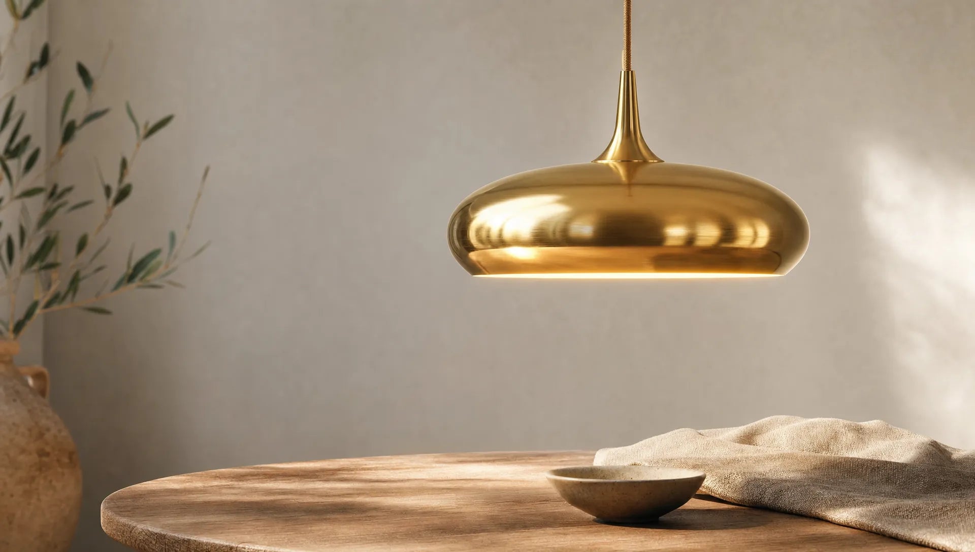
Not all gold works the same. Polished yellow gold has a different presence than brushed brass or champagne gold. Anyone looking for a subtle, homely effect is usually better off with matt or satin surfaces than with highly reflective finishes.
| Gold tone | Effect in space | Fits particularly well | What you should pay attention to |
|---|---|---|---|
| Brushed brass | Warm, quiet, high quality | Wood, natural stone, beige, greige, olive green | Ideal for living and dining areas with natural materials |
| Champagne gold | Elegant, bright, reserved | White, sand, taupe, light woods | Appears finer than classic yellow gold and is well suited for small rooms |
| Antique gold | Full of character, a bit vintage | Dark wood, leather, warm wall colors | Use sparingly so that it doesn't look heavy or old-fashioned |
| High gloss gold | Glamorous, eye-catching, reflective | Very reduced spaces, clear lines | Only use in doses, otherwise a pretentious effect will quickly occur |
If you are unsure, choose a slightly matte finish. It is more forgiving, reflects more gently and is easier to combine with existing furniture. A muted gold tone looks more harmonious, especially in open living areas where the kitchen, dining area and sofa are visually connected.
Shapes: Less decoration, more silhouette
Golden lights don't need a lot of ornaments to work. On the contrary: the more striking the color, the clearer the shape can be. A simple ball lamp, a linear pendant bar, a cylindrical shade or an organic but reduced silhouette often appear more modern than heavily decorated models.
Shapes that distribute light softly are ideal for cozy rooms. Opal glass, textile shades, grooved glass elements or light sources shielded downwards prevent glare and take away the hardness of the gold. Open sockets with visible bulbs can be attractive, but they need the right light color and very careful placement.
Size is also important. One too small Pendant Lamp gets lost and seems like a random accent. A lamp that is too large can dominate the room. The lamp can be present above a dining table, but should not appear wider than the table. A lamp width of around half to two thirds of the table width often works as a rough guide. If there are several pendulums, the entire composition counts.
Colors that calm gold
Gold feels particularly at home in warm, earthy and broken color schemes. Instead of pure white, off-white tones, cream, sand, greige, taupe or warm gray work. These colors make gold appear softer and prevent harsh contrasts.
A gold one looks very nice Pendant Lamp also with muted green, terracotta, rust, aubergine or warm brown. These combinations have depth without being loud. Gold can also work in modern homes with a lot of black, concrete or cool gray, but then needs to be balanced out by wood, carpets or curtains.
If you want to combine gold with dark accents, you should pay attention to balance. Black can frame gold very elegantly, but can also quickly appear heavy. For this look it's worth taking a look at the tips on how to create one Combine lamp black and gold stylishly without the room appearing overloaded.
Materials: This is how gold becomes warm instead of shiny
Materials are the fastest way to get a golden one Pendant Lamp grounded in a homely way. An oak dining table, fabric-covered chairs, a wool carpet or ceramic in the middle of the table create a natural counter-tension to the metal. This means that the lamp does not look like a foreign body, but rather like a part of the room concept.
Material combinations in which gold is just an accent within a calm palette are particularly harmonious. An example: brushed brass over a round wooden table, linen chairs, a wall in warm off-white and a carpet in natural fibers. Nothing about it screams luxury, but there is still value.
Be careful with too many smooth surfaces. Marble, lacquered fronts, glass, chrome and high-gloss gold can look very cool and representative together. This can be desired in hotels or bars, but at home there is often a lack of comfort. If there are already shiny kitchen fronts or polished stone surfaces, this should be the case Pendant Lamp Gold can be chosen to be matt, filigree or with a soft shade.
Light color: Warm light is mandatory
A golden lamp lives from light. If the light color is too cool, it loses its warm effect and can quickly appear cheap or bright. Warm white light colors in the range of around 2,700 to 3,000 Kelvin are usually pleasant for living rooms, dining areas and bedrooms. Even warmer light colors can be cozy, but should suit the usage.
Glare-free light is particularly important above the dining table. The lamp should illuminate faces pleasantly, make food appear appetizing and emphasize the table surface. A dimmable solution is ideal here because you can switch between everyday life, work at the table and dinner. A slightly clearer lighting effect can be useful in kitchens or work areas, but even there, gold should not be combined with harsh, cold light.
Altitude also affects the atmosphere. Above a dining table, the lower edge of the lamp is often around 60 to 80 centimeters above the table top. This isn't a hard and fast rule, but it's a good starting point. In rooms with high ceilings or unusual floor plans, adjusting the cable length can make all the difference.

Use gold hanging lamps correctly depending on the room
The same light can have a completely different effect depending on the room. It can be more present in the dining room, it shouldn't be restrictive in the hallway, and it should appear particularly soft in the bedroom. It is therefore worth taking a look at usage, viewing axes and existing materials.
| space | Good effect with gold | Suitable lamp shape | Styling tip |
|---|---|---|---|
| Dining room | Warm, communicative, inviting | Linear pendant light, cluster, shade light | Plan the lamp centrally to the table, not just to the spatial axis |
| Living room | Elegant, atmospheric | Soft shapes, opal glass, indirect light | Add floor and table lamps instead of solving everything with one light source |
| Kitchen | High quality, modern | Small pendulums over island or counter | Combine gold with matt fronts or wood, not with too much high gloss |
| bedroom | Calm, gentle, noble | Small pendulums next to the bed, textile umbrellas | Choose low luminance and warm light |
| hallway | Friendly, welcoming | Compact pendulums, clear shapes | If the ceiling is low, it is better to use flatter or open shapes |
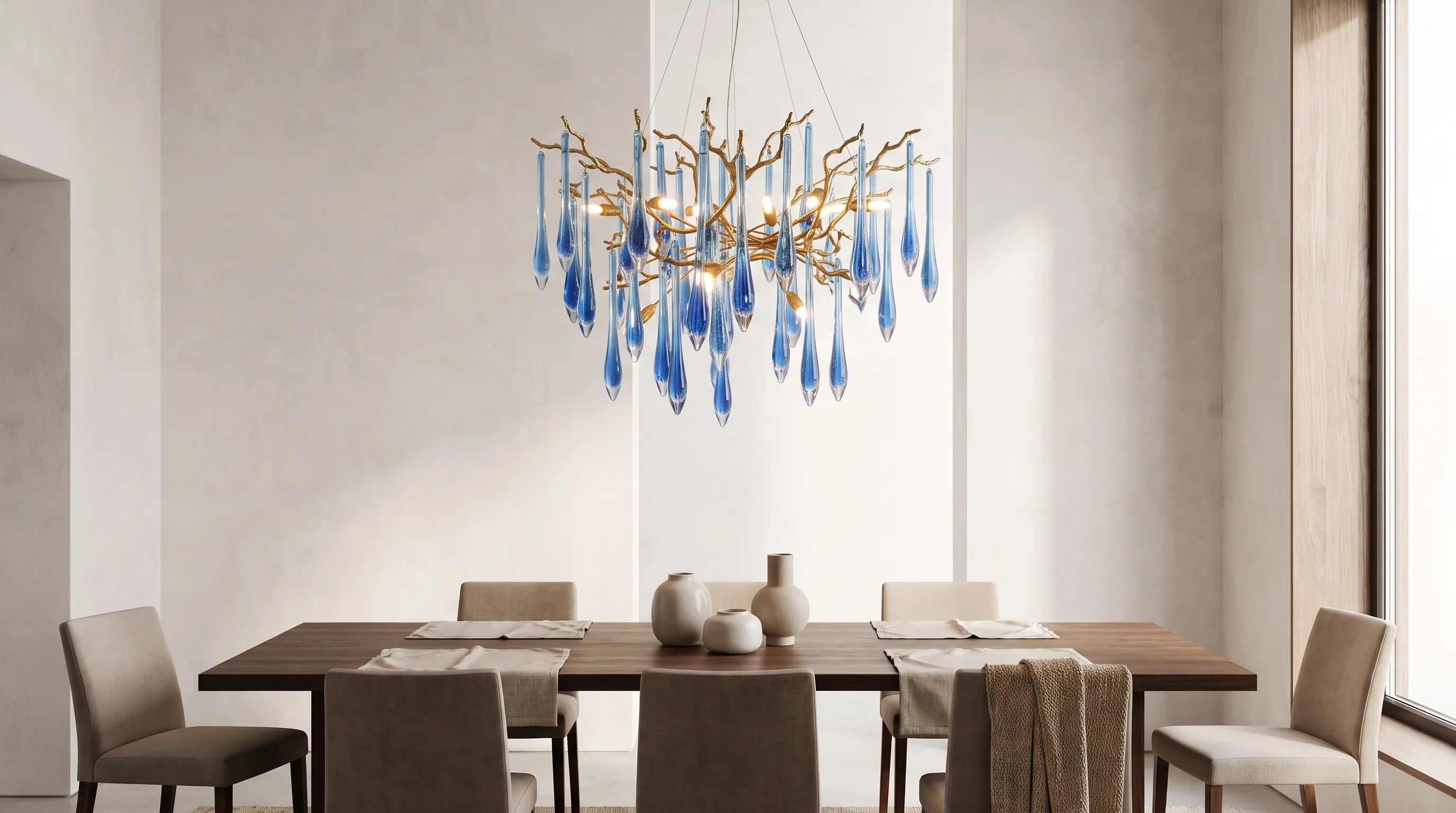
Gold works particularly well in the dining room because the lamp has a clear task there: it collects the space around the table. If you are planning a lamp over a long table, you should not only consider the appearance, but also the height adjustment. You can find more ideas about this in the article about one Height-adjustable brass hanging light in the dining room, which shows many practical styling approaches.
There should be a gold one in the living room Pendant Lamp not be the only source of light. Coziness is created by islands of light: an indirect light on the sideboard, one Floor lamps next to the sofa, maybe a small table lamp on a shelf. The Pendant Lamp gives the room structure, but the atmosphere is created through the interaction.
Don't underestimate proportions and ceiling height
A golden one Pendant Lamp attracts attention. This is why incorrect proportions are more noticeable than with reserved white or black models. In small rooms, delicate pendants, opal glass balls or slim shades often work better than solid lamp bodies. In spacious rooms, the lamp can be more sculptural, but should still retain air around it.
With low ceilings, restraint is important. A gold lamp that hangs too low can visually depress the room. Short suspensions, flat shapes or transparent elements make sense here. If the ceiling is high, the luminaire may extend more into the room. Then gold looks particularly beautiful if the cable length is deliberately planned and not left at random.
Especially when it comes to renovations and open floor plans, it's worth thinking about connection points, table positions and furniture early on. If the power outlet is not exactly above the table, a suitable canopy or an offset suspension can help. At BUYnBLUE Chandeliers and pendant lights can be customized free of charge, for example in terms of cable length, canopy or color. This is particularly helpful if the ceiling height, room layout or table position are non-standard.
The right dose: repeat gold, but don't copy it
A common mistake is to repeat gold too precisely. Lamps, handles, picture frames, candle holders and table legs in the same gold tone quickly appear artificial. Spaces become more homely when repetitions are subtler.
It is better to pick up gold two or three times in the room, but in different sizes. The Pendant Lamp may be the largest golden element. There might also be a small candlestick, a brass detail on a shelf or warm fittings on a piece of furniture. This repetition is enough for the eye to recognize a connection.
Other warm metals can also play a role. Brass, bronze and dark copper can work well together as long as the surfaces are not all very shiny. Mix using a common temperature rather than using identical color codes. A slightly aged brass next to matt champagne gold often looks more natural than perfectly coordinated but very shiny metal surfaces.
Typical mistakes that make gold look pretentious
Gold rarely has too much impact because of a single decision. Usually it is the sum of several small exaggerations: shiny surface, cool light, lots of accessories, dominant shape and hard contrasts. If you avoid this combination, the effect remains significantly more relaxing.
Very cold wall colors are particularly critical when they come into direct contact with yellow gold. Pure snow white can sharpen contrast and make gold louder. A warmer white or a muted natural tone is often the better choice. Equally problematic is a lamp that hangs too high and therefore looks like a lost decorative piece under the ceiling. A pendant light should define a zone, not just fill the room in general.
Also avoid bulbs that are visibly dazzling. Visible LED points or filament lamps that are too bright can disturb the view and weaken the high-quality effect of the lamp. If the light source is visible, it should be chosen deliberately and fit the shape.
Short checklist before purchasing
Before you go for a golden one Pendant Lamp a quick reality check will help. This way you avoid a lamp that looks nice online but appears too dominant or inappropriate in the room.
- Check gold tone: Does the finish match the wood, wall paint, handles, and other metals in the room?
- Choose surface: Matt, brushed or satin finish looks more homely than highly reflective gold.
- Plan light color: Warm white light is almost always crucial for comfort.
- Match size: The lamp should match the table, the size of the room and the ceiling height.
- Calm the environment: Natural materials and muted colors make gold appear more elegant.
- Consider customization: Cable length and canopy should match the floor plan, not the other way around.
Frequently asked questions about Pendant Lamp in gold
Which wall color goes with a gold one? Pendant Lamp? Warm, broken tones such as cream, sand, greige, taupe, warm gray or muted green work particularly well. Pure, cool white can make gold appear harder.
One works Pendant Lamp Gold too dominant in small rooms? Not necessarily. Choose a delicate shape, a matte finish and soft light. Champagne gold or brushed brass usually appears calmer in small rooms than shiny yellow gold.
Can you combine gold with silver or chrome? Yes, but consciously. Gold looks more homely when combined with warm metals such as brass or bronze. Cool metals like chrome can work, but need connecting materials like wood, stone or textiles.
Which light color goes best with gold? For living rooms and dining areas, around 2,700 to 3,000 Kelvin is usually pleasant. Light that is too cool robs gold of its warmth and can make the lamp appear bright.
How high should a gold one be? Pendant Lamp hanging over the dining table? A distance of around 60 to 80 centimeters between the table top and the lower edge of the lamp is suitable as a guide. However, the decisive factors are table size, lamp shape, viewing height and sense of space.
Conclusion: Gold becomes homely when it is given space
One Pendant Lamp Gold doesn't have to look ostentatious. With matt surfaces, warm light, natural materials and calm colors, it becomes an elegant, homely accent. What is crucial is that gold does not work against the room, but rather enhances its mood.
Therefore, plan the lamp not just as a decorative object, but as part of an overall concept of light, material and proportion. Then gold brings exactly what it does best into the room: warmth, depth and a quiet form of elegance.