
Use orange lamp skillfully without overloading the room
An orange lamp attracts attention before you even talk about furniture, wall colors or decoration. This is exactly where its strength lies, but also its risk: orange brings warmth, energy and personality into the room, but can quickly appear restless if used incorrectly.
The key is not to hide orange. What is crucial is to give the lamp a clear role. It can be an accent, a mood-setting element or a unifying color element, but not everything at the same time. This creates a space that appears bold without being visually loud.
Why orange is so effective in lighting design
Orange is between red and yellow. This makes the color appear warm, lively and inviting without automatically appearing as dramatic as red or as bright as yellow. In interior design, orange is often used to break up neutral spaces, enhance wood and natural tones or give modern interiors a more human, homely character.
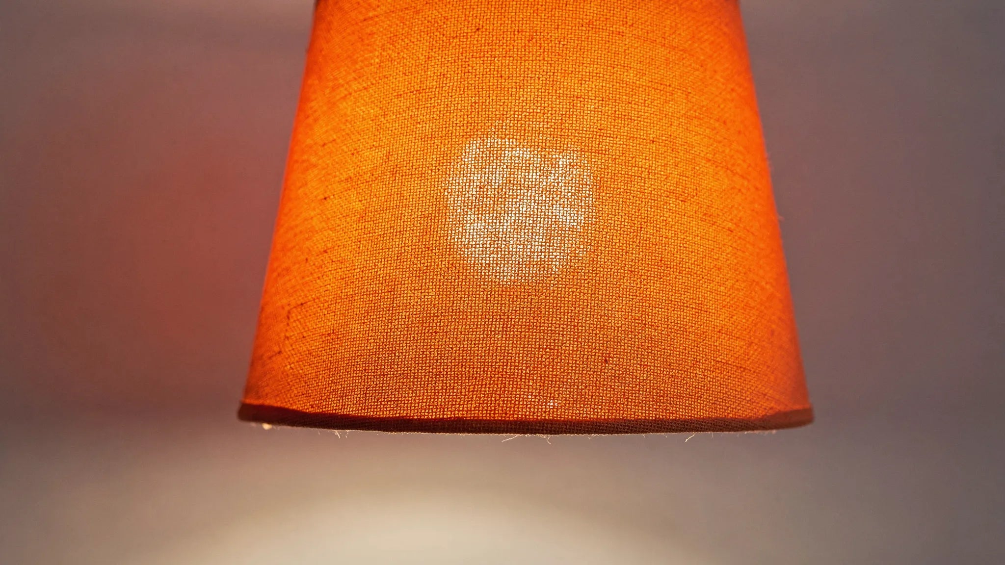
Orange is particularly interesting in lamps because color and light influence each other. An orange lampshade can act as a design object even when it is switched off. When switched on, it can make the light appear warmer, depending on the material, transparency and light source.
It is important to distinguish between an orange light and orange light. An orange lamp with a warm white bulb usually looks stylish and homely. A neutral lamp with a strong orange colored light, on the other hand, quickly appears scenic, lounge-like or decorative. For living spaces, the first option is usually more versatile.
Decide first: design object or lighting mood?
Before you choose an orange lamp, it's worth asking a simple question: Should the lamp stand out primarily because of its color, or should it bathe the room in a warm light? This decision prevents the room from being over-controlled in terms of color and lighting at the same time.
| Target | Meaningful implementation | Effect in space |
|---|---|---|
| Design accent | Orange shade, base or lamp body with warm white light | Clear eye-catcher, modern and controlled |
| Gentle atmosphere | Amber glass, copper, terracotta or slightly tinted shade | Warm, soft, homely |
| Bold color moment | Strong orange for a small lamp or individual piece | Creative, graphic, consciously placed |
| Flat color effect | Orange light or RGB LEDs | More decorative, for accents instead of permanent lighting |
For living and dining areas, an orange lighting design with dimmable warm white light is usually the most elegant solution. This means the room remains suitable for everyday use and the color appears high-quality instead of dominant.
The 10 percent rule: Use orange as an accent
A proven design rule is the 60-30-10 principle. About 60 percent of the room is the main color, for example white, beige, greige or a light wood tone. Around 30 percent can be a second color or material, such as gray, black, walnut or olive green. The last 10 percent are accents.
This is exactly where an orange lamp belongs. It does not need to be “supported” with many other orange objects. On the contrary: the stronger the light, the less additional orange decoration the room needs.
A good relationship is created when orange is repeated in a maximum of two to three places. This could be a pillow, a small art detail or a book on the coffee table. If orange is repeated in the carpet, curtains, mural, vases and lamp at the same time, the lamp loses its curated effect.
The right shade of orange for your interior style
Not every orange has the same effect. A bright signal orange tells a different story than terracotta, rust or apricot. If you don't want to overload the room, you should choose the orange tone to match the material and color concept.
| Orange tone | Fits particularly well | Effect |
|---|---|---|
| Terracotta | Linen, ceramic, oak, natural stone | Quiet, Mediterranean, organic |
| Rust orange | Walnut, leather, brass, dark green | Warm, grown-up, elegant |
| Apricot | Cream, light wood, bouclé, pastel tones | Gentle, friendly, light |
| Signal orange | White, black, chrome, concrete | Graphic, modern, energetic |
| Amber or copper | Smoked glass, marble, dark wood | Luxurious, soft, atmospheric |
As a rule of thumb: the stronger and more saturated the orange tone is, the smaller or clearer the lamp should be used in the room. A bright orange lampshade works great as a table lamp or a single pendant light. For large chandeliers or several pendants, muted tones such as rust, cognac or amber usually look more harmonious.

What type of lamp is suitable for orange?
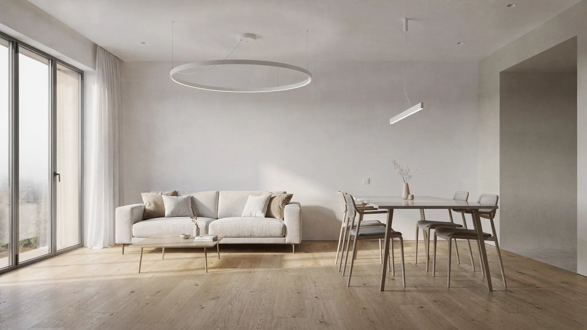
The type of lamp has a strong influence on how dominant orange appears in the room. A table lamp can easily be integrated as an accent. A large pendant light above the dining table, on the other hand, automatically takes on a starring role.
| Lamp type | Good places to work | This way the effect remains light |
|---|---|---|
| Table lamp | Sideboard, bedside table, console, shelf | Combine with a neutral umbrella base or a quiet environment |
| Pendant lamp | Dining table, kitchen island, reading corner | Just add a central color accent and reduce the surroundings |
| Floor lamp | Sofa corner, reading chair, bedroom | Choose a slim shape if the color is strong |
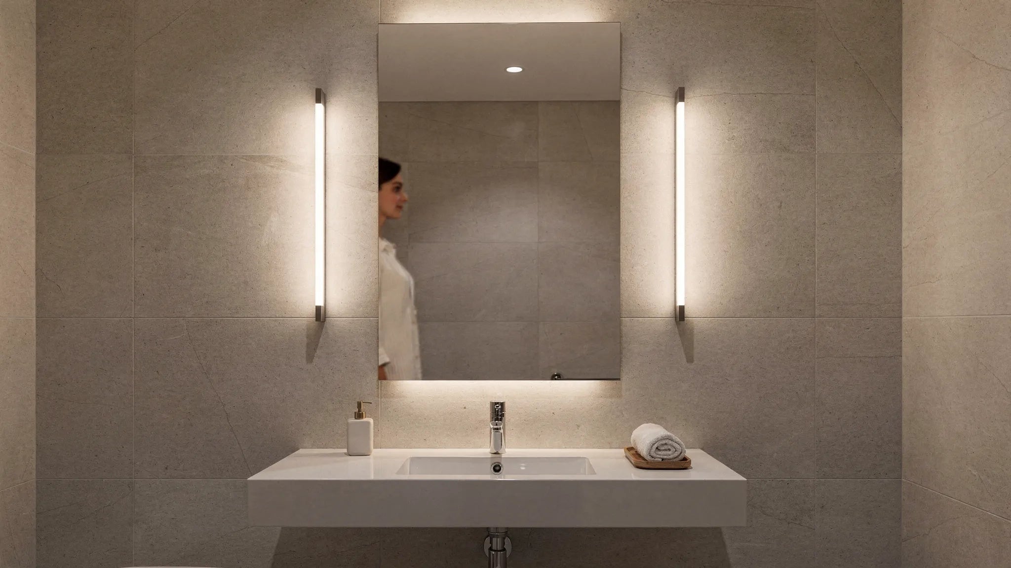
| Wall light | Hallway, bedside, art wall | Use orange as a small graphic detail |
| Chandelier | High rooms, gallery, spacious dining area | Prefer muted orange, amber or metallic tones |
If you are unsure, start with a mobile light, such as a table or Floor lamps. You can test how orange looks in the room in daylight, artificial light and in the evening. For permanently mounted pendant lights, it is worth taking a closer look at the proportions, cable length and viewing angles beforehand. You can also find out more about this in BUYnBLUE-Guide to Lamps in the right size for every room.
Color combinations that make orange look elegant
Orange needs visual calm. That doesn't mean the room has to be boring. It just means that the accompanying colors should be chosen consciously.
Orange looks very safe with warm neutral colors. Cream, sand, greige, off-white and light wood tones take away the sharpness of the color. This combination is particularly suitable for living rooms, bedrooms and dining areas where comfort is important.
Orange becomes more modern with black, off-white and clear lines. An orange pendant light above a black dining table can have a very architectural effect as long as the wall, floor and other furniture remain reserved. This combination goes well with modern apartments, lofts and minimalist kitchens.
Orange is rich in contrast, but more sophisticated, with shades of blue or petrol. Blue is the complementary contrast to orange and makes the color appear more intense. This combination should therefore be used sparingly, for example with an orange lamp in front of a muted blue wall or next to a petrol-colored armchair.
Orange looks natural and contemporary with olive green, sage green, wood and ceramic. Terracotta and rust tones in particular combine harmoniously with biophilic and Japandi-inspired furnishings.
Room-by-room: How to use an orange lamp specifically
Living room
In the living room, orange works best as an accent in a clearly defined zone. An orange table lamp on the sideboard, a floor lamp on the reading chair or a pendant lamp above the coffee table can visually tie the seating group together.
It is important not to choose a color for every light source in the room. Combine the orange lamp with subtle basic lights, indirect lighting or neutral wall lights. This creates depth without the room becoming restless. If you want to work with multiple light sources, the contribution is to indirect lighting in the living room a good addition.
Dining room
An orange pendant light can appear more prominently above the dining table because the table is a natural focal point anyway. It looks particularly beautiful over wood, natural stone or a calm table top in black, white or gray.
Make sure that the light is not hanging too low. A distance of around 60 to 75 cm between the table top and the lower edge of the pendant lamp is often used as a guide, depending on the height of the room, the size of the lamp and the lines of sight. For very high ceilings, an individually adapted cable length can be crucial.
Kitchen
In the kitchen, orange is ideal for small, precise accents. A single pendant light over the kitchen island or two smaller lights over a counter can add warmth to an otherwise plain kitchen.
However, when it comes to work surfaces, the quality of light should be a priority. Orange shades must not discolor or darken the work light too much. Neutral to warm white LEDs with good color rendering are useful for cutting, cooking and preparing.
bedroom
In the bedroom, orange should be used softly and muted. Apricot, amber, rust or terracotta seem much more relaxed than bright orange. A small table lamp or wall lamp by the bed is often enough to generate warmth.
Avoid very bright lights and strong color changes. For evening light, dimmable warm white light sources are usually more pleasant than color-intensive effects.
Hallway and entrance area
The hallway is great for making a bold first impression. An orange wall light or small ceiling light can add character to an otherwise functional area. Since hallways are often narrow, the luminaire should be compact and not protrude too far into the walkway.
Mirrors, light walls and indirect light help to make orange appear lighter. This creates an inviting entrance without making the area visually narrower.
Light quality: Orange needs the right brightness
An orange lamp only looks high-quality if the light is right. Light that is too cold can break the warm character of the color. Light that is too weak makes orange appear dull. Too strong light can make the color appear bright.
Warm white bulbs in the range of around 2700 to 3000 Kelvin are usually a good choice for living spaces. 2700 Kelvin is particularly pleasant for dining areas and cozy zones. In kitchens or near home offices, 3000 Kelvin can appear more functional without appearing too cool.
Color reproduction is also important. A CRI value of 80 or more is common for many living lights; for high-quality materials, art, textiles and dining areas, CRI 90 or higher often appears more natural. If you would like to classify technical terms such as lumen, Kelvin and CRI more precisely, this will help BUYnBLUE-Guide Buy an LED lamp: This is how you find the right model.
Dimming is particularly recommended for orange lights. During the day the lamp can act as an object, but in the evening it can create a warm atmosphere with reduced brightness. Strong colors in particular benefit if the light intensity can be adjusted.
Placement: Open space makes the accent stronger
A common mistake is to put a flashy light fixture in an already very decorated area. Orange needs air. If the lamp is placed next to many pictures, plants, patterns and colored textiles, there are too many elements competing for attention.
It is better to place the lamp in a place with a clear function. This can be the dining table, the reading corner, a sideboard or a quiet wall surface. The clearer the environment, the higher quality the color accent appears.
Line of sight is also important. Ask yourself what you see when you enter the room. An orange light can have a strong impact right there, but it shouldn't compete with a large piece of art, a statement rug, and a colorful wall all at the same time.
Three simple styling recipes
| Recipe | Ingredients | Result |
|---|---|---|
| Modern warm | Orange pendant light, black dining table, cream walls, oak wood | Clear, homely, design-oriented |
| Soft minimal | Apricot table lamp, light sofa, bouclé, glass, off-white | Soft, light, feminine and modern |
| Retro elegant | Rust orange floor lamp, walnut, leather, brass, warm white LEDs | Full of character, grown-up, cozy |
These recipes work particularly well because orange doesn't act in isolation. The color is embedded through materials, warmth and lighting rather than simply added as decoration.
Common mistakes that make rooms appear cluttered
- Using too many orange accessories in the same field of vision.
- Combine strong orange with many other saturated colors.
- Use a large orange pendant light in a very small, already full room.
- Choose cold bulbs with 4000 Kelvin or more for cozy living areas.
- Match the lampshade, carpet, cushions and wall art exactly the same orange.
- Avoid dimmability, even though the lamp is intended to serve as mood lighting in the evening.
The last point in particular is often underestimated. A colored light does not have to have the same intensity at all times of the day. With dimming, multiple light sources and a clear distribution of roles, it appears much more flexible.
When is an individual adjustment worthwhile?
When it comes to pendant lights and chandeliers, it's not just the color that determines the effect, but also the proportion. A beautiful orange lamp can appear distracting if it hangs too high, too low, or off the center of the table. An unsuitable ceiling rose can also spoil the overall impression.
BUYnBLUE offers a free customization service for chandeliers and pendant lights, for example for cable length, ceiling rose or color. This is particularly helpful if you have high ceilings, sloping room axes, a long dining table or a special color idea. This means that the lamp can be integrated not only visually but also spatially.
Anyone planning a complete concept should also consider basic lighting, zone lighting and accent lighting together. For a structured approach, the article is worth reading professional lighting plan for home.
Frequently Asked Questions
Does an orange lamp also fit in small rooms? Yes, but it should be used specifically. In small rooms, table lamps, slim wall lights or small pendant lights work better than very large, dominant models. Light walls and reduced decoration make orange appear lighter.
Which wall color goes best with an orange lamp? Cream, off-white, greige, sand, light gray, sage green and muted blue are particularly harmonious. Very intense wall colors should only be chosen if the room is intentionally designed to be rich in contrast.
Should an orange lamp also emit orange light? Warm white light is usually better for living rooms. Orange light can be exciting as a decorative effect, but in everyday life it quickly appears artificial. An orange light with a warm white bulb is more versatile.
Which light color is ideal for orange lights? Around 2700 to 3000 Kelvin is recommended in the living room, dining room and bedroom. These warm white light colors support the warmth of orange without discoloring the room.
How often should orange repeat in the room? Two to three small repetitions are usually enough. An orange light can be picked up by a pillow, an art detail or a ceramic object. Too many repetitions quickly appear deliberate and overloaded.
Can a pendant light be adjusted in color or length? At BUYnBLUE Chandeliers and pendant lights can be customized free of charge, including cable length, ceiling rose or color. This helps to match the lamp exactly to the room height, table position and style concept.
Conclusion: Courageous but controlled
An orange lamp is not a random element. Used correctly, it brings warmth, personality and design excitement into modern rooms. The decisive factors are dosage, light quality and a quiet environment. When Orange is given a clear task, it doesn't seem loud, but conscious.
Discover at BUYnBLUE modern lights and designer lamps, who design rooms with high quality and individuality. Enjoy curated designs, high-quality materials, free customization for pendant lights and chandeliers, free worldwide shipping, and a 14-day return policy.